StoryBrand Website Checklist: Does Your Website Pass The Test?
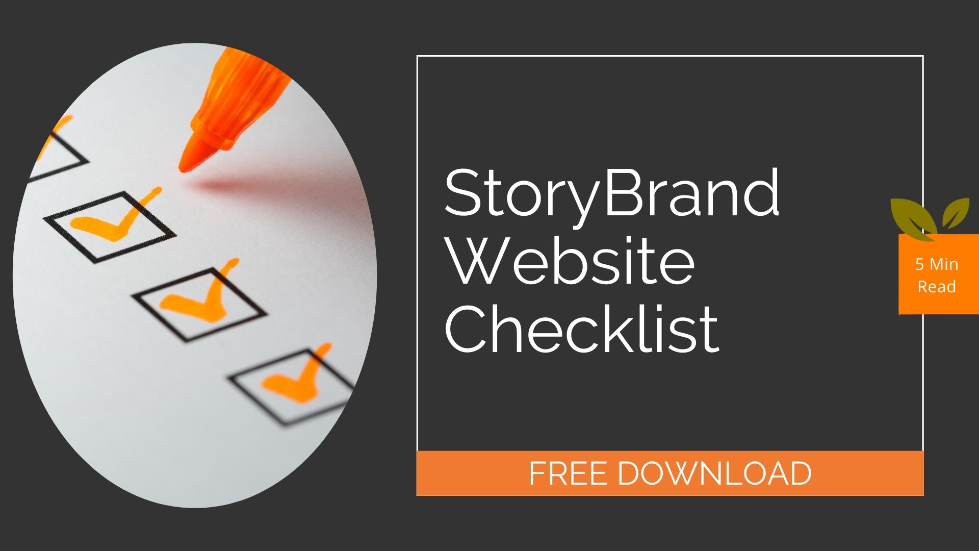
Not sure if your website is conveying a clear message about what your business has to offer? As a StoryBrand certified partner, we have created a StoryBrand Website Checklist to determine what you’ve got right and what you’re missing.
StoryBrand Header Checklist
Your website visitors and potential customers should be able to figure out what you’re offering them in the first two seconds of visiting your website. It’s important that this information is clear, easy to see and encourages your visitors to become customers. This is what we call the grunt test. Could a caveman view your website and know what you are selling, how it benefits him and how does he buy it?
Download Our StoryBrand Website Checklist
Use this handy checklist to evaluate your website. We are happy to help review any items here.
Call To Action Checklist
Your website is not the place for subtlety. What you want your visitors to do should be obvious and easy to do. There should be buttons with links to your Call To Action whether it’s scheduling a call, booking an appointment, or buying a product. For the customers that aren’t quite ready to take a big step yet, you should have a smaller offer available for them like a free video, a downloadable checklist or ebook.
Value Proposition Checklist
The value in what you have to offer should be clearly communicated. You should be answering your customer’s questions before they have a chance to ask them. Do this by using language that might come up in the buying process, and providing information that will answer expected questions. Icons and symbols that bring attention to your statements and messages are very important. You want your site to be easy to scan over but still getting the message across that your business can make their life easier.
1,2,3 Plan Checklist
When it is time for your customer to take out their wallet, there can be hesitation. To take away friction, we break down what we want customers to do next into three simple steps.
Loss Avoidance Checklist
If you’ve communicated how great your product or service is effectively, then your potential customer should be thinking about what they might be missing out on if they decide not to do business with you. The risk of not working with you should be made known. Make sure you’re providing a reminder on what they will be missing out on if they fail to do business with you.
Footer Checklist
Make sure your Main Navigation area isn’t crowded with too many links. You can move some of these links to the bottom of the page (the junk drawer) so they are easy to find if you’re looking for them. Utilizing drop down menus will also help declutter important real estate on your site. Your contact information should also be easy to find at the bottom of your site. If there are any pages that don’t center around benefitting your customer you may want to rethink their necessity.
Grab the checklist here: BigOrange StoryBrand Website Checklist PDF
Share the knowledge
How to Market Managed IT Services?
In the competitive world of IT, effective marketing is crucial for MSPs to stay afloat. Its important to understand the value of your services and…
Explore this TopicWhat Is Marketing in the IT Industry?
Marketing in the IT industry requires a blend of traditional strategies with more modern digital techniques designed to draw in target audiences and possible consumers. …
Explore this TopicHow Big Is the MSP Industry?
The managed service provider (MSP) industry has seen substantial growth over the past decade. Because our reliance on technology has steadily increased over the years,…
Explore this TopicWhat Does Managed IT Services Mean?
Managed IT services is a practice that many businesses are choosing now, outsourcing the responsibility of maintaining and managing their technology. This is an alternative…
Explore this TopicHow Do I Find a Marketing Agency for My MSP?
Here are a few simple steps to take as you research and find an MSP marketing agency: Should I Hire a Marketing Agency for My…
Explore this TopicLeveraging ChatGPT: A 10-Step Guide to Crafting an Effective AI Marketing Campaign (In Just 45 Minutes!)
Creating a compelling AI marketing campaign can be a daunting task, especially when time is limited. BigOrange Marketing is here to help with an engaging…
Explore this TopicIs Content Marketing Dead? What Business Owners Need to Know Now
With search algorithms continuing to get smarter and new AI tools more able to produce volumes of content with ease, does content even matter anymore?…
Explore this TopicLearn How to Leverage AI to Create Marketing Campaigns at CompTIA
Gone are the days of marketing campaign planning taking hours upon hours to complete. With our ChatGPT strategy you do not need to spend hours…
Explore this Topic